Developed by Google in 2011, Google+ was an attempt from Google to make a social media platform akin to Facebook or Twitter.
I will explain the issues with Google+ using five of the Ten Usability Heuristics for User Interface Design.
- Google+ was an example of poor Consistency and standards. An example below is the messy layout as there's no clear indication of what a user should place their eyes on first. Violation Score: 4
- Google+'s User control and freedom were flawed. The data breach that occurred in 2018 effectivity caused the platform to lose many users since that year. Violation Score: 4
- Google+'s Flexibility and efficiency of use were poor. A big example of this was the Circles feature. On paper, this sounds like a great way to group things, but the problem arises when the user realizes that the info on the circle itself is vague. Violation Score: 4
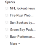
- The Recognition rather than recall of Google+ was problematic. An example of this would be how the Sparks feature worked: you had to pick a series of channels related to that topic. Violation Score: 3
- The Visibility of the System Status of Google+ was poor. An example would be its Email system. unlike Gmail, Google+'s email would display the same things seen in its notifications, which is ironically more faster to access. Violation Score: 4


Comments
Post a Comment